Résumé Optimization
Table of Contents
Introduction
How to do Résumé Fortune-Telling
Formatting
Basic Guidelines
Tailoring
Cultural Context
Template
Achievements
Job Titles
Explaining Pivots
Addressing a Résumé Gap
Rich Information
LinkedIn
Bonus: Uniqueness
Introduction
I can tell whether you have friends based on your résumé. It reveals a lot more about you than you think.
I’m going to walk you through my exact thought process when I look at someone’s résumé, including how to demonstrate that you are more capable than the other applicants
1.1 How to do Résumé Fortune-Telling
People often come to me with a goal without understanding the broader context. Make a map. Break down a goal to figure out where to focus your attention
Let’s do a very simple example of this:
A résumé is to get you a job
→ What is a job?
A job is an exchange of value between a person and a company
→ What value is being exchanged?
You are exchanging your time for money
→ Why should the company give you money?
A company wants to hire you because you can make money for them. Therefore, your résumé should reflect this.
Suppose I’m hiring a digital marketing agency. Their pitch is, “We made ads for companies.” Would you hire this company?
What if they said, “For every dollar a client invested in us, we made them three dollars (3x return on adspend). We did this for a dozen mid-market roofing companies this year.” Now that’s interesting
And this is also why a company is going to think you’re a monkey if you hand them a bad résumé–it means you can’t even think about the person you’re talking to
There are three key elements that demonstrate your competence:
Formatting
Achievements
Rich information
I’ll also cover how to design your LinkedIn, and a bonus section on Uniqueness:
2. Formatting
We are not looking at whether you used a particular résumé format from, say, Harvard. Rather, your formatting reflects your network and understanding of industry standards. Poor formatting suggests that you lack friends at the major universities and the industry. Otherwise, someone would have reviewed it. You will not be an unbiased judge of your own résumé; therefore, you should always have someone else review it
Your résumé layout must emphasize its content. I often see people using varied text and font sizes to make their résumé stand out. This is distracting, and violates basic design rules
One of the principles of user experience design is to make the interface invisible. I should not have to think about how to use the interface to complete my task
What are some examples of this? Consider how much focus is taken away when you have to change the settings on an old-school television. There are poorly-labelled buttons organized in a non-intuitive way. The buttons are on the back, so I have to keep turning around to see whether I hit the right one. All of these detract away from the primary goal of just changing the settings
Now, contrast this with a touchscreen interface on a tablet. I can just tap on the Netflix app, tap the gear icon, change what I want with a few taps, and done. I didn’t have to think–it just worked
In that same way, I should be able to look at your résumé and get the information I need. I have hundreds of applicants to get through, so I’m going to spend at most a minute per résumé
If you make me hunt for the information, I’ll get annoyed and skip it, even if you are the most qualified candidate. I’ll just assume you’re a weirdo without friends. Make it easy for my eyes to follow along your page
You do this by formatting your résumé in an F-shape. Eye-tracking studies reveal that people read top-to-bottom and left-to-right:
2.1 Basic Guidelines
Contact Information: start with name, email, city, website at the top. you don’t need to overdo this with every social profile
Sections: for new grads and interns, education at the top. For people with experience, work experience at the top. Include a section for extracurriculars, projects, and miscellaneous information as needed
Bullet Points: no sub-bullets
File Format: PDF only because it looks the same on every device
Experience: reverse-chronological order, with most recent on top
Dates: aligned to the right, month and year only; for extensive experience, years only
Length and Layout: single page, single column; for very senior-level positions, two pages max
Language: flawless grammar and absolutely zero typos. do not use acronyms and jargon that people outside the company will not understand
Time: continuously make edits over time. I would not be surprised if it requires 5 revisions to make a decent first draft. Edit and wait. You will find errors when you look at it with a fresh set of eyes
2.2 Tailoring
You should not tailor per job. This is common advice given by recruiters, but think about the incentives. Of course a recruiter would love you to make a résumé that is specific to the job posting. It makes their job easier
But you don’t have time to tailor each application 🐱🎂
Instead, tailor per role. Find some job postings for the role you want, copy a few of the the descriptions, paste them into chatGPT, then ask it to generate the top themes. It will give you what is generally expected of that role. Use those themes to tailor your résumé
Remember our principles of design: if you are hiring for someone in a particular role, do not have extraneous information that detracts away from that. I don’t want to know about your experience as a chef if I am hiring for a programmer role. The only exception is if I’m specifically looking for someone who has worked in the culinary industry because I develop restaurant software. Otherwise, I don’t need to know things like you driving for Uber in the evenings
2.3 Cultural Context
Be aware of the cultural context of the countries you are applying to. For example, countries like Germany and the UAE previously expected photos on their résumé, although this has been changing in the last few years
The reason is that hiring should be skills-based, and you should not introduce potential bias. Personal information such as age, gender, citizenship, relationship status, number of children, religion should be omitted
Even if the person seems unbiased, don’t introduce anything to their subconscious that may affect your hiring chances
2.4 Template
Any template that is single-page, single-column, with an easy-to-read font and formatting is fine. I have a free template in my mentorship group that is up-to-date with industry standards. I can personally take a look at your résumé as well
3 Achievements
Your résumé should tell a story about consistently good decision-making and winning. Have you been solving complex problems and taking on more responsibilities? Have you done better than others in a competitive setting?
You should think about competition whenever you write something on your résumé. A mistake I often see is people including trivial certifications that require no preparation. These can be taken as many times as you want or by Googling the answers. Something like an AWS or Azure cert is valuable, unlike freeCodeCamp
Early on, achievements may look like a good university, academic awards, scholarships, an internship, winning a hackathon, or holding a leadership position.
As you become more senior, expectations increase. It’s typical to have examples of success within a company. But outside of your company, you could have open-source contributions, spoken at seminars, written publications, or filed patents
They are not looking for many “things” on your résumé. They are looking for evidence of someone who is intelligent and hard-working, with drive and determination. The best way to demonstrate this is competitive achivements, paid experience, and projects that solve actual problems (unlike another To-Do list app)
Someone who is exceptional in one domain will do well in anything. This is why a history of solving problems in competitive environments translates anywhere. People want winners. Winners win
Sly Fox Tip: Fixing your résumé isn’t just about editing text. It also includes fixing your weaknesses by doing stuff in real life. If you want to motivate yourself and outline a vision, make an “ideal” résumé. Then, work backwards. Use your future self’s résumé as a strategic guideline
3.1 Job Titles
To improve the “story” of your résumé, don’t use use formal titles if they don’t make sense. Use the title that most closely matches your responsibilities. Companies may have specific names that don’t make sense to other companies. For example, for software roles on wall street, an “associate” would be a software developer and a “vice president” would be senior software engineer
Alternatively, you can specify using parenthesis. If you went from iOS to working on Android, you can say Software Engineer (iOS and Android)
The reason why I recommend being specific, e.g. iOS and Android, is because the we are trending towards specialization. “Full-Stack Developer” has a negative connotation, especially as a junior. Put exactly what you are looking for: front-end developer, back-end developer, and so on because that is what you will be tested on. Use your strengths as a selling point
3.2 Explaining Pivots
If you are coming from a different field, you must be careful if they ask you why you became interested in software. You should not talk about money or eventually wanting to leave. You want the interviewer to think that you are committed
A good answer should focus on a passion for the industry. You want to emphasize that you’re interested in learning the skills required to impact the group. You can also mention that you want to work with intelligent and high-achieving people, and want to push yourself. The goal is to come off as a positive, ambitious person without being too arrogant
Here’s an example answer:
I do not regret majoring in art history. That said, my interests have evolved towards more analytically challenging pursuits. This past year, I’ve taken more computer science and math classes, and believe that software engineering is an exciting challenge that marries my interests in critical thinking and quantitative analysis
Specifically, software engineering interests me because it presents an opportunity to develop substantive analytical skills, while developing a close network of colleagues. While working long hours is scary to some, to me, it is in a strange way exciting. I have a very strong work ethic, and I am excited to be involved in work that helps companies scale their technology.
Obviously don’t be this formal. Nobody actually speaks like this. But, notice how this person frames their liberal arts background as a positive. They also mention various transferable skills such as analytical writing. Don’t just say “writing” because it’s too vague. Remember: the more specific, the better
3.3 Addressing a Résumé Gap
Do: if you’ve been out of work for some time, put a one-liner about freelance work that you’ve done, or certifications that you’ve been working on. Anything to show that you weren’t sitting around
Don’t: waste precious time talking about what you did since you were laid off. I’ve had people talk for several minutes about how they traveled the world or about irrelevant side projects. It’s not useful for the interviewer. Remember, they are trying to evaluate how much value you can bring to the company
4 Rich Information
The amount of detail on your résumé shows whether you have been taking on responsibility or coasting. Ambiguous bullets are a red flag
This does not mean to write more information. Rich information provides scope: who, what, where, when
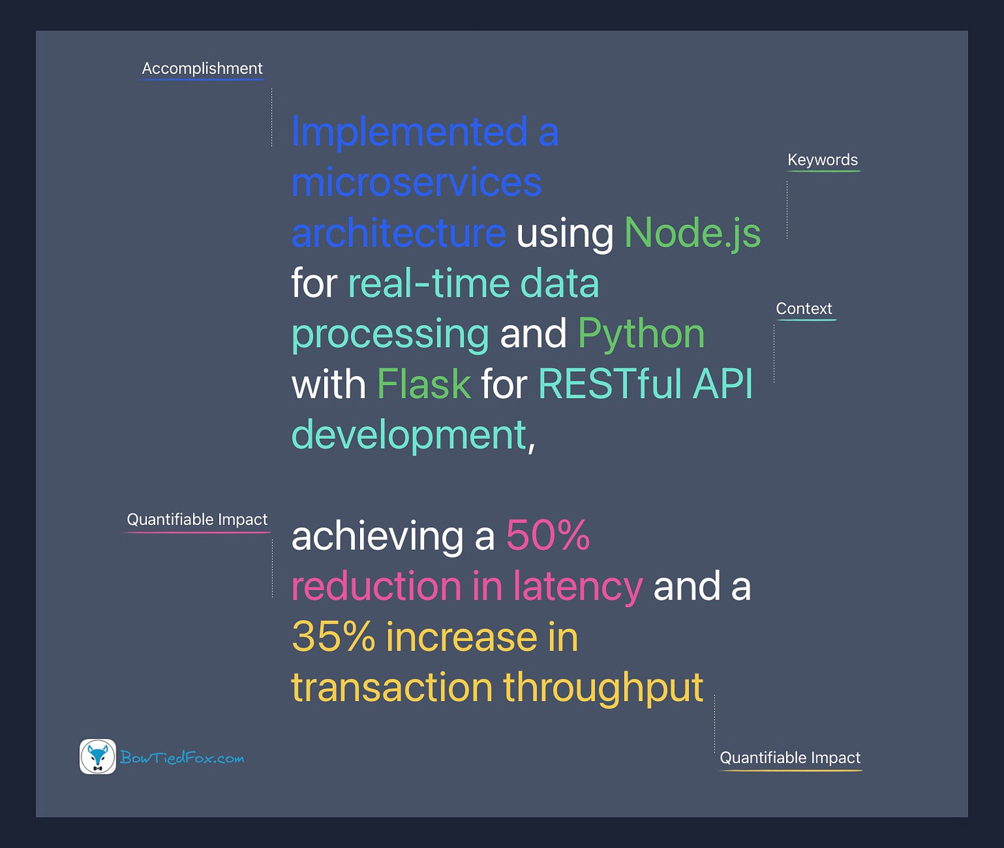
If you want to show that you can provide value, you need to write your bullet points with this formula:
CONTEXT + ACCOMPLISHMENT + QUANTIFIABLE IMPACT
Hint: You can ask ChatGPT to make your bullets according to this format and to make it more “professional”
Be specific and give context. This is one of the reasons I dislike objective, summary, and profile sections. You should be showing me your achievements, not telling me “I’m hard working, I’m driven, I’m smart.” Everyone says that about themselves: it’s non-verifiable information. This is also why you should not self-rate your skill-levels or include praise from references
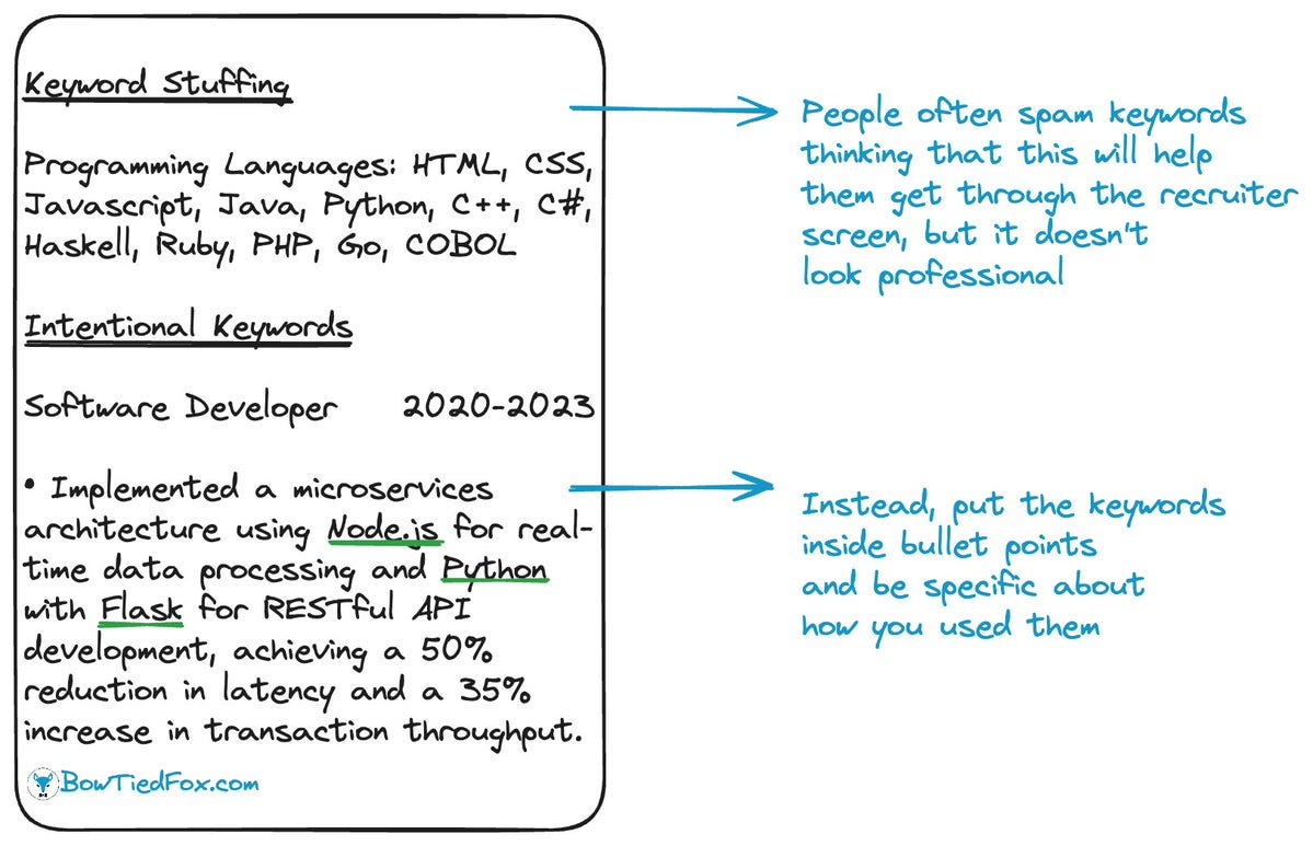
In contrast, quantitative information is highly recommended. Numbers never lie. Weave them into your bullet points, just like keywords:


